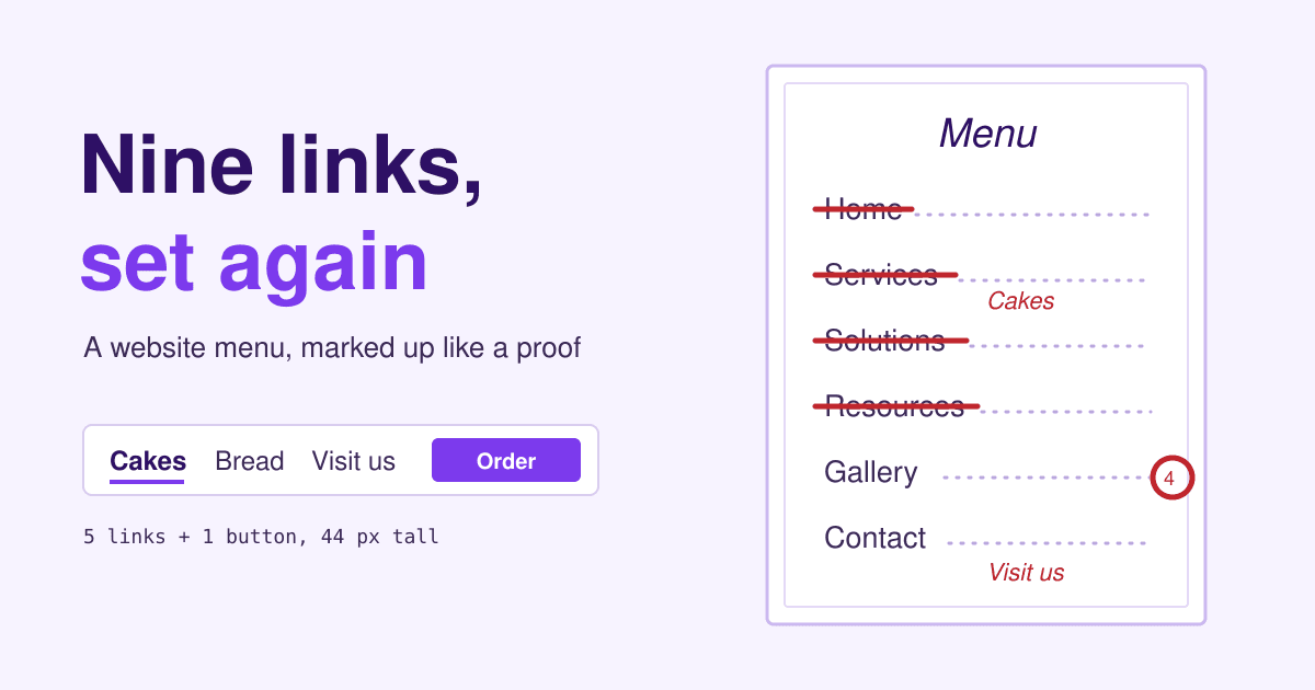
Nine links sat in the top menu of a small bakery website, and not one of them said the word cake.
The bakery is made up, but its menu is not rare: it is the one a theme ships with, filled in with the words a designer reaches for first. Below it is marked up the way a printer marks a proof, one numbered mark per problem. Then it is set again, and every mark gets its reason.
What the Menu button opens, on a laptop screen with room to spare:
- Home 1 delete
- About Us 2 to footer
- Our Story 2 merge, to footer
- Services 3 say what
- Solutions 3 say what
- Resources 3 say what
- Gallery 4 onto cake page
- Shop (opens on hover, 14 items) 5 one button
- Contact 6 say when, where
Short answer: show the menu on any screen wide enough to hold it, and name each link after the thing a customer came for (Celebration cakes, not Services). Drop Home, because the logo already goes there, and move About, Blog and the rest of the second-tier pages to the footer. Make every link a plain <a href> at least 44 px tall, mark the current page, and replace hover menus with a page or a click. Then test the labels on five people before you call it done.
The same menu, set again
Five links and one button. Each label is a word a customer would type into a search box, the order follows what people come for, and the thing that earns money sits apart at the end.
Open today 7:00 to 18:00 - 12 Mill Lane
9 links before, plus 14 in a hover menu
5 links after, plus one button
0 pages deleted: the rest moved to the footer
Ten marks, and the reason for each
Every change below comes from a usability study, a published guideline or a search engine's own documentation. The main checklist behind most of them is Nielsen Norman Group's menu design guidelines.
-
7 Menu button on a laptop Links in view
In a Nielsen Norman Group study of 179 people on six sites, desktop users opened a hidden menu in only 27% of tasks, against 48% when the links were in view and 50% when some were. They were at least 39% slower with the hidden menu. On phones a button is fine, but showing one or two links beside it helped there too: 86% used a partly visible menu against 57% for a fully hidden one.
-
1 Home Logo links home
The logo in the top corner, linked to the home page, already does this job, and the slot is better spent on a thing you sell. Keep a plain Home link in the footer for anyone who looks for the word.
-
2 About Us, Our Story About, in the footer
Two links to the same idea make visitors guess which one holds what. Merge them into one page. The footer is where people look for the pages that matter to fewer visitors: the story, jobs, press, the blog.
-
3 Services, Solutions, Resources Celebration cakes, Bread and pastries, Wholesale
These three words could belong to an accountant or a plumber. NN/g's guidelines ask for clear, specific and familiar wording and warn against abstract categories, and its piece on made-up category names shows people skip labels they cannot predict. Put the key word first, so a scanning eye finds it in the first two words.
-
4 Gallery Photos on the cake page
A gallery link splits the pictures from the prices and the order form. Put the photos where the decision happens, on the page that sells the thing in them.
-
5 Shop, opens on hover Order online button
Hover does not exist on a touch screen or for keyboard users, and a menu that opens and shuts as the pointer drifts annoys everyone else. NN/g recommends menus that open on click, with a caret that shows a link opens a submenu, and warns against menus of more than one level. Fourteen products fit better on one order page than in a pop-out list.
-
6 Contact Visit us
For a shop people walk into, most of what hides behind Contact is when and where. Say so in the label, and print today's hours and the street in a thin line above the menu, so the commonest question is answered before anyone clicks.
-
8 No sign of the current page Underline and aria-current
NN/g calls a menu that fails to show where you are probably the single most common mistake it sees, and it matters most for visitors who land on an inner page from search. Underline the current link and add
aria-current="page", so screen readers announce it too. -
9 Links made of script Plain a href links
Google says it can generally crawl a link only when it is an
<a>element with anhref; a<span>with a click handler may never be followed. Your menu is the one set of links on every page, so it is the worst place to get this wrong. -
10 Rows 18 px tall 44 px tall
WCAG 2.2 sets a minimum target of 24 by 24 CSS pixels at level AA, and 44 by 44 at level AAA. A menu link costs nothing to make 44 px tall, and it is the link a thumb taps most.
The new menu in plain HTML
No framework and no script: a <nav> of ordinary links. On phones, a <details> element opens and closes the list without any JavaScript, while the order button stays outside it.
<header class="site-header">
  <p class="hours">Open today 7:00 to 18:00 - 12 Mill Lane</p>
  <a class="logo" href="/">Example Bakery</a>
  <a class="order" href="/order">Order online</a>
  <details class="menu" open>
    <summary>Menu</summary>
    <nav aria-label="Main">
      <ul>
        <li><a href="/cakes" aria-current="page">Celebration cakes</a></li>
        <li><a href="/bread">Bread and pastries</a></li>
        <li><a href="/wholesale">Wholesale</a></li>
        <li><a href="/visit">Visit us</a></li>
      </ul>
    </nav>
  </details>
</header>

/* every link a full tap target */
.menu a, .order { display: inline-flex; align-items: center; min-height: 44px; padding: 0 12px; }
.menu a[aria-current="page"] { text-decoration: underline; text-decoration-thickness: 3px; text-underline-offset: 6px; }
/* wide screens: always open, button hidden */
@media (min-width: 900px) { .menu summary { display: none; } }
Keep the open attribute in the HTML. Wide screens hide the Menu button, so the list has to be open already or nobody there can reach it. On a phone the list then starts open and one tap on Menu folds it away; if your site builder or theme can close it on small screens, let it do that there and nowhere else. Either way every link is in the HTML for search engines from the first load.
Test your own menu in ten minutes
A label only works if strangers read it the way you meant. Five people are enough to catch the big misses: Jakob Nielsen's well-known estimate is that five testers find about 85% of a site's usability problems.
- Write five tasks in customers' words. "Can I get something gluten-free for a birthday on Saturday?" not "Find the Celebration cakes page". Never use a word that appears in the menu.
- Show only the header. A screenshot of the top of one inner page, on the device most of your visitors use.
- Ask one question per task: where would you click first? Write down the label, and how long they hesitated.
- Rename what two people miss. If two of five pick the wrong link for a task, the label is the problem, not the people.
- Run it again with five new people after the change. Friends and family count, staff do not: they already know the menu.
| Task | Right link | First clicks of 5 |
|---|---|---|
| Something gluten-free for a birthday on Saturday | Celebration cakes | 4 right, 1 Order online |
| Are you open on Sunday? | Visit us | 5 right |
| Loaves for my cafe every morning | Wholesale | 3 right, 2 Bread and pastries |
The figures are an example of how to fill the sheet in. The third row would send Wholesale back for a clearer label, such as "Bread for cafes and shops".
Questions about website menus
How many links should a top menu have?
As many as the main jobs your visitors come for, and no more. There is no rule of seven: a visible menu does not have to be remembered, only scanned. The bakery needed five; a shop with forty product types needs a mega menu or category pages instead.
Is a hamburger menu bad?
On a phone it is often the only room you have. On a laptop or desktop screen it hides links that would fit, and the NN/g study above found people used hidden menus about half as often there. On phones, keep your most important link or button beside it.
Does the menu affect search rankings?
It helps Google find and understand pages. Plain <a href> links are the ones Google reliably follows, and Google reads link text to learn what the linked page is about, so "Celebration cakes" says more than "Services".
Dropdown menu or a separate page?
A one-level dropdown that opens on click is fine. Once it needs a second level, send people to a page that lists the options instead; NN/g advises against menus that cascade into further menus.
Sources
- Nielsen Norman Group: Menu-design checklist: 17 UX guidelines, Hamburger menus and hidden navigation hurt UX metrics, Category names, Footers and Why you only need to test with 5 users, read 2026-11-09.
- Google Search Central: Link best practices for Google, read 2026-11-09.
- W3C: WCAG 2.2, Target size (minimum), 2.5.8 and Target size (enhanced), 2.5.5.
- MDN Web Docs: aria-current, the nav element and the details element.