The experts who have measured the page fold agree on more than the arguments about it suggest: visitors scroll, but only after the first view gives them a reason, and a page that looks finished at its bottom edge stops them there.
The panel
Every statement below is quoted from a page you can open, with its date. Nothing is paraphrased inside quotation marks. Where a speaker gave a number, the number is theirs; where we draw a conclusion, it sits under "What it means for your page" and is ours.
- 1Jakob Nielsenusability researcher, 1997
- 2Bruce Tognazziniinterface designer, 1998
- 3Matt CuttsGoogle search engineer, 2012
- 4Tony Haileanalytics company chief, 2014
- 5Amy Schadeusability researcher, 2015
- 6Kim Flahertyusability researcher, 2016
- 7Therese Fessendenusability researcher, 2018
- 8Felix Arntz and Rick Viscomiweb performance engineers, 2021
The statements, in speaking order
Jakob Nielsen Nielsen Norman Group
December 1997, "Changes in Web Usability Since 1994"
In more recent studies, we have seen that most users scroll when they visit a long home page or a long navigation screen.
In the same piece he notes that in his early studies only 10% of users scrolled a navigation page, and that even willing scrollers "may be tempted to choose one of the initially visible options". Read it on nngroup.com.
The "nobody scrolls" rule was already retired in 1997. What survived is the second half: whatever links and buttons show first get chosen first. Put the action you want most (call, book, get a quote) among them.
Bruce Tognazzini AskTog column
27 July 1998, "Silo Design for Web Transactions"
The first screenful of a web page--or any other foreign document--tends to look complete. Unless the screen happens to break across some graphical element or divides a line of text in two, users will assume they have seen it all and will move on.
This is where the term "illusion of completeness" comes from. Read it on asktog.com.
A page that ends cleanly at the bottom edge of the phone looks finished. Let a photo, a card or the next heading cross the bottom edge so the cut is visible.
Matt Cutts Google
19 January 2012, Google Search Central blog, "Page layout algorithm improvement"
Rather than scrolling down the page past a slew of ads, users want to see content right away.
Google said the change "noticeably affects less than 1% of searches globally", aimed at sites with "only a small amount of visible content above-the-fold", and that a layout fix shows once Googlebot recrawls, which "can take several weeks". The post now carries a note pointing to Google's page experience documentation. Read it on developers.google.com.
The target was pages buried under ads, not small business pages. But a first view filled by a cookie banner, a newsletter box and a stock photo also shows "a small amount of visible content". Make sure your own words are visible before anything that asks for a click.
Tony Haile then chief executive of Chartbeat
March 2014, TIME, "What You Think You Know About the Web Is Wrong"
Here’s the skinny, 66% of attention on a normal media page is spent below the fold.
The figure comes from Chartbeat's engaged-time tracking on media sites. In the same article: "a stunning 55% spent fewer than 15 seconds actively on a page". Read it on time.com.
This is the dissent on the panel, and it is about news articles: people who stay on a story spend most of their time reading further down. It does not say the top is unimportant. Read it next to his 15-second figure: the top decides whether a visitor stays long enough to scroll at all.
Amy Schade Nielsen Norman Group
1 February 2015, "The Fold Manifesto: Why the Page Fold Still Matters"
Users do scroll, but only if what’s above the fold is promising enough.
Her numbers: in 57,453 eyetracking fixations, the 100 pixels just above the fold were viewed 102% more than the 100 pixels just below it; in a Google display-ad study she cites, ads just above the fold were 73% viewable and ads just below 44%. NN/g took the midpoint, 84%, as its best estimate of the difference. Read it on nngroup.com.
Every screen size has its own fold, so there is no single pixel line to design to. Write the top of the page so it gives a reason to keep going: what you do, for whom, where.
Kim Flaherty Nielsen Norman Group
17 January 2016, "The Illusion of Completeness: What It Is and How to Avoid It"
Avoid full-screen hero content. When using large banners, carousels, or videos in the hero space, ensure that additional content peeks above the fold to lead users to scroll further.
In the test behind it, users were asked what a food delivery service offered; its home page opened with a full-screen video, and six out of eight users did not realize they could scroll. Read it on nngroup.com.
A full-height photo with one button on it is the most common small business hero. Cut it to well under the screen height so the first line of the next section shows.
Therese Fessenden Nielsen Norman Group
15 April 2018, "Scrolling and Attention"
Reserve the top of the page for high-priority content: key business and user goals. The lower parts of the page can accommodate secondary or related information. Keep major CTAs above the fold.
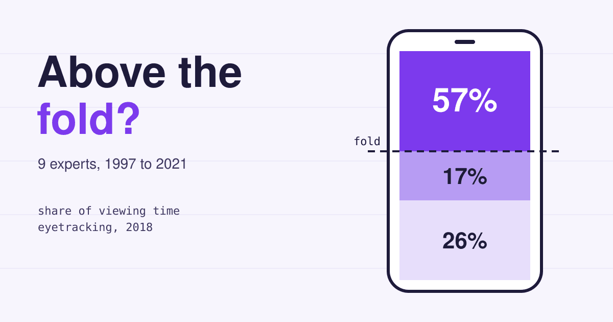
Her data, from more than 130,000 fixations by 120 people on a 1920 by 1080 screen: 57% of viewing time above the fold, 74% in the first two screenfuls, 81% in the first three, against 80% above the fold in NN/g's 2010 study. Read it on nngroup.com.
People scroll more than they did in 2010, and still look at the top most. Your most important line and your main button belong in the first view; the gallery, the history and the long story can sit lower.
Felix Arntz and Rick Viscomi web.dev
2021 analysis on web.dev, "The performance effects of too much lazy loading" (page updated March 2022)
More eagerly loading images within the initial viewport---while liberally lazy loading the rest---can give us the best of both worlds: fewer bytes loaded and improved Core Web Vitals.
In HTTP Archive data, the median page without image lazy loading had a 75th percentile Largest Contentful Paint of 2,922 ms against 3,546 ms with it; they call that correlation, then ran an A/B test on a WordPress theme to check cause. Read it on web.dev.
The fold also matters to the browser: the first-view image should load at once, and everything lower can wait. A hero photo marked loading="lazy" slows the very part people look at most.
The short answer
Visitors scroll, and they have since at least 1997. They scroll when the first view tells them the page is worth it and when something visibly continues past the bottom edge. So the first view of a small business page should hold three things: what you do and where, the one action you want, and the top of whatever comes next. Everything else can go lower.
Where they agree, and the one split
People scroll
Nielsen 1997, Schade 2015, Fessenden 2018, Haile 2014
Measured as 10% of users on early navigation pages, then "most users" by 1997, then 43% of viewing time below the fold in 2018.
The top decides whether they do
Nielsen 1997, Schade 2015, Fessenden 2018
Visible options get picked first; scrolling happens "only if" the top is promising; the share of attention still drops sharply after the fold.
A clean bottom edge stops the scroll
Tognazzini 1998, Flaherty 2016
Twenty years apart, the same failure: a first view that looks finished. Six of eight test users missed the rest of one page.
Content first, not clutter
Cutts 2012, Haile 2014
From opposite sides, search and advertising, both say the top should carry what the visitor came for.
Load the first view first
Arntz and Viscomi 2021
Eager images in the initial viewport, lazy loading for the rest.
The split: 66% below or 57% above?
Haile's 66% below the fold and Fessenden's 57% above it measure different things on different pages. Chartbeat counted engaged time on news pages across its client sites; NN/g counted eye fixations of 120 people doing set tasks on many kinds of sites. Neither number cancels the other. For a page that sells a service rather than a story, the NN/g pattern is the closer fit, and Haile's own 15-second figure points the same way: most visitors decide at the top.
How much attention each view of the page gets
A first-view brief for a small business page
Open your home page on a phone, take a screenshot without scrolling, and check it against these five lines. Each one rests on a statement above.
Say what you do, for whom and where
One heading a stranger understands: "Dog grooming in Leeds, by appointment" beats "Welcome". This is the "promising enough" test from Schade.
Show the main action
The call, booking or quote button sits in the first view, as Fessenden advises and as Nielsen saw in 1997: visible options get chosen.
Cut the hero short
Keep a banner photo well under the screen height so the next heading peeks in (Flaherty, Tognazzini).
Keep your words ahead of interruptions
Cookie notices, chat bubbles and sign-up boxes should not cover the opening lines (Cutts on visible content; see also our post on pop-ups Google calls intrusive).
Load the first-view image first
No
loading="lazy"on the hero picture; lazy load the pictures lower down (Arntz and Viscomi).
Phones differ in height, so do the check on two or three of the widths worth testing, not one.
The same advice, in HTML and CSS
<!-- First-view picture: load at once, at high priority -->
<img src="/img/salon-front.webp" width="1200" height="800"
     alt="Our salon on Market Street" fetchpriority="high">

<!-- Pictures further down: let the browser wait -->
<img src="/img/gallery-1.webp" width="800" height="600"
     alt="A poodle after a full groom" loading="lazy">

/* Hero shorter than the screen, so the next section peeks in */
.hero { min-height: 60svh; } /* instead of height: 100vh */
The 60svh value is our suggestion, not a number from the panel; any height that leaves the next heading visible on your smallest test phone does the job.
Questions owners ask about the fold
Where exactly is the fold on a phone?
There is no single line. Schade's point in 2015 was that every screen size has its own fold, and a responsive page has several. Check your page on two or three common phone sizes and design for the shortest.
Will Google rank my page lower if the important part is below the fold?
Google's 2012 change targeted pages with little visible content and heavy ads at the top, and it said the effect was on less than 1% of searches. A small business page with its own text in the first view is not what it described. Google now points owners to its page experience documentation.
Is a long home page a mistake?
No. People do scroll; NN/g measured 43% of viewing time below the first view in 2018. A long page works when the top gives a reason to continue and sections are easy to scan.
Do I need a "scroll down" arrow?
Schade's article says designs "shouldn't need an arrow to tell users to scroll". Letting content cross the bottom edge does the same job without one.
Sources
- Jakob Nielsen, Changes in Web Usability Since 1994, Nielsen Norman Group, December 1997.
- Bruce Tognazzini, Silo Design for Web Transactions, AskTog, 27 July 1998.
- Matt Cutts, Page layout algorithm improvement, Google Search Central blog, 19 January 2012.
- Tony Haile, What You Think You Know About the Web Is Wrong, TIME, March 2014.
- Amy Schade, The Fold Manifesto: Why the Page Fold Still Matters, Nielsen Norman Group, 1 February 2015.
- Kim Flaherty, The Illusion of Completeness: What It Is and How to Avoid It, Nielsen Norman Group, 17 January 2016.
- Therese Fessenden, Scrolling and Attention, Nielsen Norman Group, 15 April 2018.
- Felix Arntz and Rick Viscomi, The performance effects of too much lazy loading, web.dev, last updated 31 March 2022.
- Google, Understanding page experience in Google Search results, read 2026-11-12.