The 1,080 pixels on a phone's spec sheet do not reach your website: the browser reports a width near 400, and that is the number your layout has to fit.
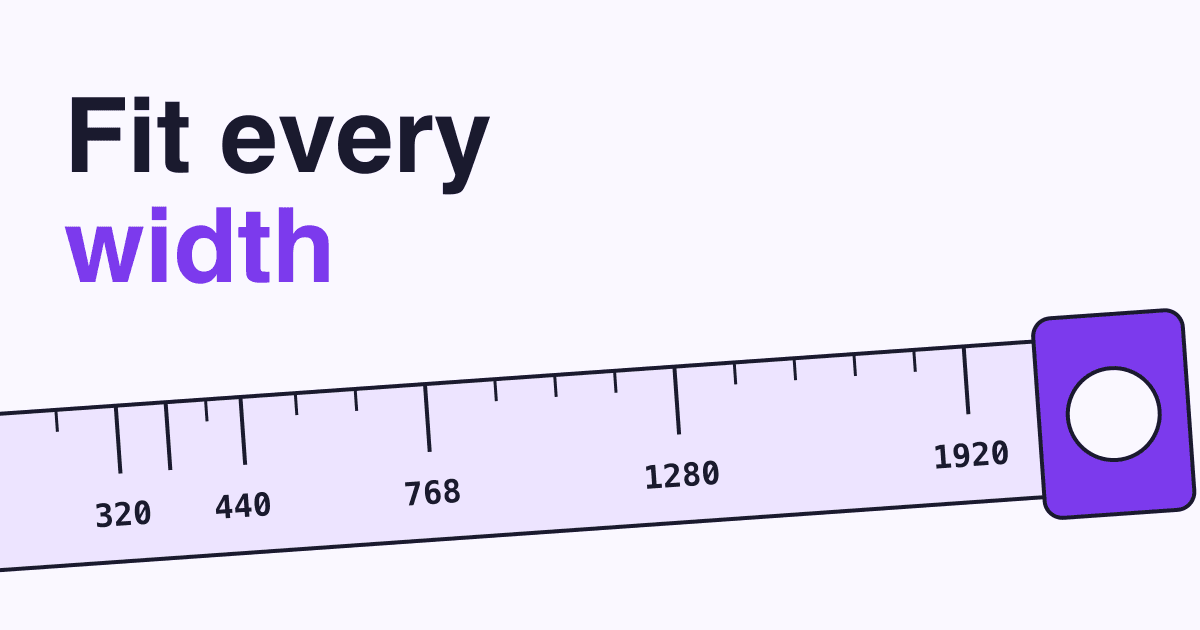
Short answer: make your site work at every width from 320 to at least 1920 pixels, and check six of them by hand: 320, 360, 440, 768, 1280 and 1920. Then drag the browser window slowly between them and watch for the moment something breaks. Each one is a common width, an edge of the range, or a width a known rule uses, and the dragging catches what a list of devices misses.
What does "screen width" mean for a website?
It means the width in CSS pixels, not the hardware pixels on the box. Three terms cover everything in this post:
- CSS pixel
- The unit your layout is measured in. Device pixel ratio is how many hardware pixels stand for one CSS pixel, so a 1,080-pixel-wide panel at a ratio of 3 reports 360.
- Viewport
- The part of the browser that shows your page. On most phones it is the whole screen; on larger monitors it is the size of the browser window, which can be much narrower than the screen.
- Breakpoint
- The width at which your CSS changes the layout, such as moving from one column to two.
Which widths do visitors actually have?
Most listed screens sit in two bands: phones from 360 to about 430 pixels, and desktops and laptops from 1280 to 1920. These figures come from StatCounter for October 2025 to September 2026.
- 360Phone8.7%
- 375Phone2.8%
- 384Phone3.8%
- 390Phone3.4%
- 393Phone3.7%
- 412Phone2.6%
- 414Phone5.5%
- 768Tablet0.2%
- 800Desktop2.8%
- 1280Desktop5.4%
- 1366Desktop3.3%
- 1536Desktop4.0%
- 1920Desktop9.4%
- 2560Desktop1.4%
The split changes with your market. Phones averaged 52.3% of page views worldwide over those 12 months, against 46.3% for desktop and 1.5% for tablets. In the US, desktop led with 54.5% to 43.4% for phones, and in Europe it was 50.5% to 47.3%. The share also swings by up to about 10 points between months: phones went from 49.3% worldwide in August 2026 to 59.1% in September, and led in all three that month. StatCounter's pages open on that latest month, so its numbers will not match these 12-month averages. The leading phone width changes too:
| Device | Worldwide | US | Europe |
|---|---|---|---|
| Phones | 360: 16.7% 414: 10.5% 384: 7.2% 393: 7.0% | 414: 16.7% 390: 12.2% 375: 9.0% 393: 8.0% | 414: 14.1% 384: 11.3% 360: 10.8% 393: 9.7% |
| Desktops | 1920: 20.4% 1280: 11.7% 1536: 8.6% 1366: 7.2% | 1920: 28.3% 1536: 8.2% 1280: 8.1% 800: 6.8% | 1920: 28.1% 1536: 12.2% 1280: 8.1% 1366: 5.0% |
| Tablets | 768: 10.9% 800: 9.2% 1280: 7.8% 810: 7.2% | 800: 11.0% 768: 9.9% 820: 9.5% 810: 9.0% | 768: 13.0% 800: 11.6% 1280: 9.8% 810: 7.2% |
Read these rows with care. 1536 x 864 is exactly 1920 x 1080 divided by 1.25, which fits a 1080p laptop at 125% display scaling. StatCounter also lists 800 x 600 and 1280 x 1200 under desktop, at 6.0% and 6.3% worldwide, and does not say why; 1280 x 1200 is over half of the worldwide 1280 figure. Neither is a normal laptop size, so we would not design for them, but they are one more reason not to assume "desktop" means wide. StatCounter does not publish how it reads the size, but these rows look like full screens in CSS pixels (what screen.width returns), not browser windows.
Your own analytics beat any world table. If your site records screen sizes, compare your top rows with these and move the checks below to match.
Which six widths should you test?
Each width below has a reason, either a real audience or a rule to meet. Between them they cover the narrowest size you must support and the top worldwide phone, tablet and desktop widths.
| Size | Width | Why it is on the chart |
|---|---|---|
| XS | 320 | The floor of WCAG 1.4.10 Reflow (Level AA). It also stands for a 1280 window zoomed to 400%, so it tests people who enlarge your page, not only small phones. |
| S | 360 | The most common phone width in StatCounter's worldwide table. |
| M | 440 | The widest phone row in the US table, at 3.0%. The US and European leader, 414, sits just below it. |
| L | 768 | The top tablet width worldwide, and the one breakpoint Bootstrap and Tailwind share by default. |
| XL | 1280 | The window behind WCAG's 320 (at 400% zoom), a default Tailwind breakpoint, and the narrow laptop case where a wide navigation bar starts to wrap. |
| XXL | 1920 | The most common desktop width worldwide, in the US and in Europe. Check that text does not stretch into lines too long to read. |
Why is a list of devices not enough?
Because visitors do not arrive in six sizes. A person with a 1920 screen who snaps the browser to half of it is at 960, a width few device lists include. web.dev says it plainly: "It's best to choose your breakpoints based on your content rather than popular device sizes", because those sizes change with every release cycle. A layout should change where it starts to look wrong, whatever the width happens to be.
You can feel this in the box below. Drag its bottom-right corner, then read the ruler. The small site inside changes at 420 and 600 pixels of its own width, not at the width of any phone.
No mouse, or a small screen? This box cannot be dragged there. It has three layouts: one column under 420 pixels, two from 420, and three with a full menu from 600.
Many sites inherit their breakpoints from a theme or framework. In the 2022 Web Almanac, 57% of pages used a min-width of 768 and 51% a max-width of 767, so the seam between those two numbers is worth checking on its own. Bootstrap's other defaults are 576, 992, 1200 and 1400; Tailwind's are 640, 1024, 1280 and 1536.
How do you test a website at these widths?
- Check the viewport tag first. View the page source and look for
<meta name="viewport" content="width=device-width, initial-scale=1">. 95.2% of mobile pages have a viewport tag (2025), but without one, some mobile browsers lay the page out at a typical 980 pixels and shrink it, and your small-screen breakpoints may never run. - Open device mode. In Chrome, open DevTools and switch on the device toolbar. Choose Responsive and type a width.
- Walk the six widths on your key pages. Use the home page, a service or product page, the contact form and your longest page. At each width, look for a sideways scrollbar, cut-off text, and buttons that overlap or sit too close.
- Drag slowly between them. Pull the width from 320 up to 1920 and stop wherever the layout jumps or looks cramped. Write down that width.
- Zoom to 400%. On a 1280 window, browser zoom at 400% gives you the 320 case with real text, and the page should still read top to bottom.
- Finish on a real phone. Chrome calls device mode "a first-order approximation" and says that when in doubt, you should run the page on a real device. Fill in your form with your thumb.
What usually breaks, and how do you fix it?
Most faults come from something with a fixed size. Hand this list to whoever maintains your site.
- The page scrolls sideways on a phone. Usually something has a fixed width, or a long unbroken string or
100vwpushes past the edge. Find it and addmax-width: 100%to images and boxes. Give wide tables their own scrolling wrapper. - The menu wraps onto two lines around 1280. Move the breakpoint for the collapsed menu up to the width where the items stop fitting.
- A full-screen hero hides its button on phones.
vhfollows the large viewport, so a browser's address bar can cover the bottom. Usesvh, which always leaves room for it.dvhfollows the bar as it moves, but MDN warns it can resize content during scrolling. - Buttons are hard to hit. WCAG 2.5.8 (Level AA) asks for 24 by 24 CSS pixels with some exceptions, WCAG 2.5.5 (Level AAA) for 44, Apple for 44 by 44 points and Android for 48 by 48 dp. Aim for 44 or more. Expecting 48 pixels and 8 pixels between targets, the Web Almanac's last Mobile Web chapter, from 2022, found only 42% of mobile sites had sufficient tap targets.
- Text runs edge to edge at 1920. Set a maximum width on the text column; our guide to readable text has the numbers.
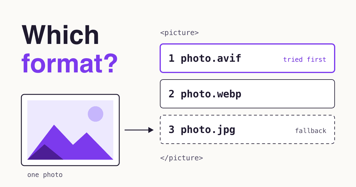
- Pictures look soft or load slowly on phones. Serve several sizes, in the right file type for each picture.
What do website owners get wrong about screen sizes?
"My phone is 1080p, so my site needs 1080 pixels."
The panel has them, but a device pixel ratio of 2.6 to 3 turns 1,080 into roughly 360 to 412 CSS pixels. Extra hardware pixels sharpen the page; they add no room.
"My buyers are on desktop, so mobile can wait."
Google says it "uses the mobile version of a site's content, crawled with the smartphone agent, for indexing and ranking". A weak mobile page matters even if most of your sales close on a laptop.
"PageSpeed passed, so the site fits."
Lighthouse's mobile test emulates one screen, 412 x 823. It says nothing about 320, 768 or a half-width window.
What should you check before calling a page finished?
- No sideways scroll at 320, 360 or 440
- Page still reads at 400% zoom on a 1280 window
- Menu works at 767 and 768
- Nothing wraps oddly at 1280
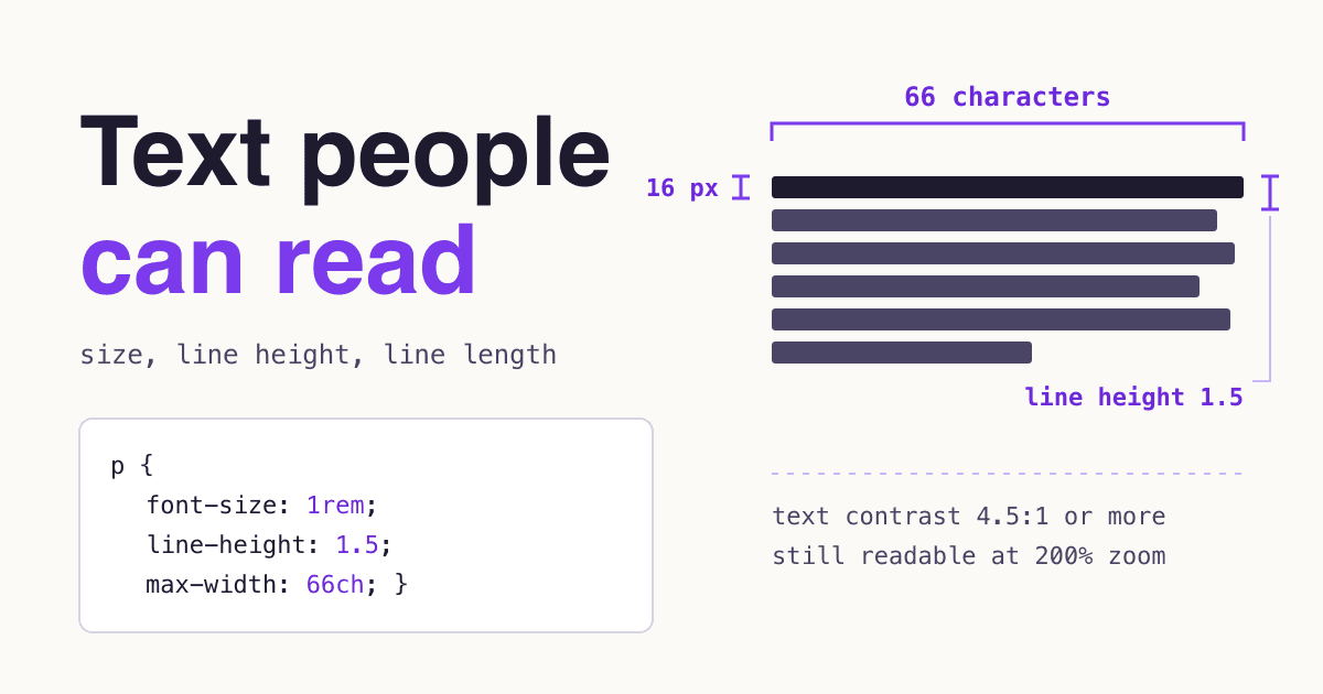
- Text column stops growing well before 1920 (about 75 characters a line)
- Buttons and links are easy to tap, 44 pixels or more where you can
- Main button stays visible with a phone's address bar showing
- Contact form completed on a real phone
Accessibility overlaps with most of this list. Our accessibility fix list covers the errors that testing for width will not find.
Common questions about website screen sizes
What is the best screen size to design a website for?
There is no single best size. Start with the layout for a phone around 360 pixels wide, then let it grow, because a narrow layout widens more easily than a wide one shrinks. Keep it working up to at least 1920.
What is the most common screen resolution?
On desktop worldwide, 1920 x 1080, at 20.4% from October 2025 to September 2026. On phones, 414 x 896 led at 10.5%, while 360 was the most common width once heights are added together, at 16.7% (StatCounter).
How many breakpoints does a website need?
As many as its content asks for, and no fixed number. Add one where the layout stops looking right. Bootstrap ships six tiers, counting its extra-small default, and Tailwind five, and a simple site often needs fewer.
Should I still support 320 pixels?
Yes. It is at least 2% of US phone screens and is not in StatCounter's top rows worldwide or for Europe, but WCAG Reflow uses it, and anyone at 400% zoom on a 1280 window lands there.
Are tablets worth testing separately?
Yes, but briefly. They were 1.5% of page views worldwide and 2.2% in the US and Europe. Test 768, because many themes change layout there.
Sources
- StatCounter Global Stats: mobile, desktop and tablet screen resolutions and device type share, worldwide, United States and Europe, October 2025 to September 2026, downloaded 2026-10-31.
- W3C: Understanding Reflow, Target Size (Minimum) and Target Size (Enhanced).
- MDN: Viewport concepts, viewport meta tag, length units, devicePixelRatio and Screen.width.
- Web Almanac: SEO 2025, CSS 2022 and Mobile Web 2022.
- web.dev: Media queries, Google Search Central: mobile-first indexing, Lighthouse emulation settings, Chrome DevTools device mode.
- Bootstrap 5.3 breakpoints, Tailwind CSS responsive design, Apple Human Interface Guidelines: Buttons, Android Developers: accessibility.